“The future is clean, friendly, connected—and there are probably bubbles in it.”
A visual field guide · c. 2004–2013
Frutiger Aero.
The future, rendered glossy.
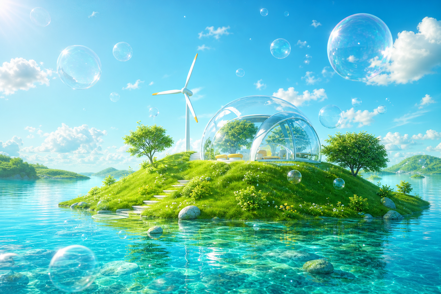
Blue skies. Wet grass. Glass buttons. Bubbles, fish, and an earnest belief that technology and nature were about to get along beautifully.
2004–13 peak era
2017 named in hindsight
∞ blue-sky optimism
2004–13Peak visibility
nature + technology
A name for a familiar feeling
What exactly is Frutiger Aero?
A retrospective label for the bright, glossy design language that filled software, advertising, packaging, and public interiors in the mid-2000s and early 2010s.
It paired digital polish with idealized nature: translucent controls, rounded icons, water droplets, green hills, tropical fish, flowers, lens flare, and saturated blue-green color. Its interfaces were often skeuomorphic—made to look touchable, dimensional, and reassuringly familiar.
The name was coined after the era had largely passed. It combines Frutiger, Adrian Frutiger’s friendly humanist typeface, with Aero, Microsoft’s glassy Windows Vista design language. The label describes a wider cultural look; not every example literally used either one.
FRUTIGERhumanist, legible, warm
AEROglass, light, motion
CARI credits Sofi Lee/Xian and Froyo Tam with developing and naming the category.
Read the CARI entry ↗Anatomy of the aesthetic
Six ingredients make it Aero.
You do not need every motif at once. Three or four, handled earnestly, usually make the family resemblance unmistakable.
Gloss & glass
Specular highlights, reflections, translucency, chrome edges, and gel-like buttons make the digital world feel physical.
Nature + tech
Grass, water, clouds, fish, leaves, and clean cities suggest progress without environmental cost.
Skeuomorphic depth
Controls resemble switches, glass, paper, or polished objects—familiar metaphors for a newly digital audience.
Fresh saturation
Cyan, cobalt, lime, leaf green, white, and sunny orange create a crisp, energetic tertiary palette.
Friendly geometry
Rounded corners, soft arcs, orbs, swooshes, and pill shapes remove the threat from advanced technology.
Humanist type
Open, legible sans serifs—often Frutiger-like rather than literally Frutiger—keep the future approachable.
Y2K Futurism
Chrome, cyberspace, silver hardware, alien curves, and turn-of-the-millennium uncertainty.
Frutiger Aero
Organic nature, glassy Web 2.0 surfaces, friendly devices, and uncomplicated progress.
Flat Design
Reduced shadows, flat color, geometric icons, simpler systems, and less visual metaphor.
From default to daydream
A short history of the shiny future.
It was not launched as a movement. The look accumulated across interfaces, stock graphics, consumer products, architecture, and advertising—then received a name only after flat design replaced it.
Open the history overview ↗- 1998–2003
Prehistory
Y2K futurism, Mac OS X Aqua, Windows XP’s “Bliss,” gel buttons, and early Web gradients establish the visual vocabulary.
- 2004–06
The language coheres
Web 2.0 branding, glossy interfaces, Windows Vista’s Aero language, and nature-tech advertising make the look ubiquitous.
- 2007–13
Peak Aero
Windows 7, game-console menus, early smartphones, app icons, packaging, and eco-future campaigns carry it into daily life.
- 2013–19
The flattening
Flat design and minimalist brand systems remove texture, gradients, and literal metaphors. Aero begins to feel dated.
- 2020s
Revival & reclassification
Online communities turn a once-ordinary corporate language into a nostalgic archive, expanding it into a named family.
The Frutiger family
One family, many climates.
These branches are community-made categories, not an official design standard. Names overlap, and the canon continues to evolve. This atlas covers the most widely cited family tree, including seasonal fan variants.
Frutiger Aero
The central blend: glossy skeuomorphism, bright nature, soft geometry, blue-green optimism, and friendly high technology.
- Glass + bubbles
- Grass + sky
- Touchable UI
Frutiger Eco
Moves sustainability to the foreground: solar panels, wind turbines, leaves, efficient cities, and technology with a tiny footprint.
- Clean energy
- Eco-cities
- Leaf green
Frutiger Metro / Vectordelia
Flattens Aero into youthful urban vectors: silhouettes, splatters, floral swirls, music graphics, and explosive tertiary color.
- Flat vectors
- Urban energy
- Paint splashes
DORFic
“Daylight, Orange, Red, Futurism, Graphic”: an industrial, semi-abstract corporate style built from arcs, light, machinery, and hot accents.
- Orange + red
- Industrial
- Abstract tech
Helvetica Aqua Aero
A marine version of Aero full of tropical water, dolphins, fish, coral, beaches, clear bubbles, and an almost musical sense of joy.
- Marine life
- Clear water
- Tropical cyan
Technozen
Quiet, spacious tech optimism associated with early-2000s Japanese interiors and console menus: white space, soft neutrals, and calm soundscapes.
- Soft minimalism
- Japanese tech
- Calm UI
Dark Aero
Preserves glass, glow, and dimensional interfaces but swaps sunny fields for black, graphite, electric blue, acid green, and sleek machinery.
- Black glass
- Neon glow
- Sleek hardware
Frutiger Aurora
Nature becomes pure light: luminous ribbons, bokeh, saturated gradients, nebula-like haze, and the dreamlike wallpaper side of Windows-era design.
- Light ribbons
- Bokeh
- Violet + cyan
Frutiger Glacier / Cyber Glacier
A wintry offshoot built from crystalline ice, silver-white surfaces, pale blue interfaces, arctic water, and pristine cold light.
- Ice crystals
- Silver blue
- Clean cold
Frutiger Jolly
A Christmas remix of Aero and Metro: glossy ornaments, candy color, vector snowflakes, bright winter skies, and cheerful commercial sparkle.
- Holiday gloss
- Vector snow
- Candy color
Frutiger Evil / Frutevil Aero
The optimistic promise collapses: polluted water, red skies, dead landscapes, disaster imagery, and glossy technology turned ominous.
- Apocalypse
- Toxic color
- Broken promise
Beyond the common family tree
The extended umbrella keeps growing.
Some catalogs treat these as relatives, descendants, motifs, or microgenres rather than direct subtypes. Select a name to reveal its relationship.
Abstract Tech
Blue-black sci-fi interfaces, circuits, hexagons, arcs, and visual shorthand for “advanced technology.”
Bright Tertiaries
Round-edged corporate design using lime, teal, orange, purple, and flat humanist patterns.
Four Colors
Electric lime, sky blue, hot pink, and neon orange—popular in mid-2000s consumer electronics and Japanese retail.
Vectorbloom
Maximalist digital florals, Art Nouveau curves, psychedelic gradients, and elaborate vector ornament.
Vector Música
A softer Vectordelia offshoot with music notes, flowing staves, hearts, stars, pastel gradients, and magical-girl energy.
UrBling
Urban grunge with street silhouettes, power lines, graffiti, splatters, flames, and mid-2000s hip-hop influence.
Hands Up
Neon dancers, light trails, glossy type, and kinetic euphoria linked to 2005–13 electronic music graphics.
TechnoNeko2000
Early anime-web “moe futurism”: glossy characters, cables, headphones, cyan-lime interfaces, and anthropomorphized hardware.
Tranquil Serenity / Frutiger Zen
Commercial digital wellness: CGI water, bamboo, lotus flowers, stacked stones, reflective bubbles, and spa-like harmony.
Fotonight Web
A 2020s meme microgenre based on low-quality, dreamlike, bootleg Frutiger Aero montages.
Neo-Aero
The contemporary revival: deliberately exaggerated glass, bubbles, fish, hills, and sunshine made for nostalgic online culture.
More than a wallpaper
Nostalgia for a future that never quite arrived.
Frutiger Aero now feels powerful because it remembers technology before the mood shifted toward surveillance, platform fatigue, and endless flat interfaces. Its world is commercial and artificial—but sincerely hopeful. The bubbles are doing emotional work.
Not just WindowsIt appeared across software, consoles, advertising, products, interiors, and stock imagery.
Not the same as Y2KY2K looks toward an uncertain cyber-future; Aero presents a clean, usable future already here.
Not one strict style guideIt is a retrospective cultural category, so edge cases and family labels naturally overlap.
Keep exploring
Source shelf
This guide synthesizes a research archive, a history overview, and living community taxonomies.